Tuesday, 21 November 2017

Album Covers

Analysis of Album Covers

The covers by Johnny Cash have a consistency: Cash's Logo is just his second name placed as a masthead on the cover (at the top and center) he uses the same large, bold font to keep a consistency with his covers, he uses the font as his brand. His central image is usually a minimalist image of the artist, sometimes with a prop, he always uses a black and white or tinted filter to follow his theme, somber country music, his music is usually sorrowful, talking about the artists past drug addiction and felonies as well as age and the concept of death. So his covers usually follow the same dull and upsetting themes as his music.

The Legend of Johnny Cash
25 October 2005

Songs in Album: Cry! Cry! Cry!, Hey Porter, Folsom Prison Blues, I Walk The Line, Get Rhythm, Big River, Guess Things Happen That Way, Ring of Fire, Jackson, A Boy Named Sue, Sunday Mornin' Comin' Down, Man in Black, One Piece At A Time, Highwayman, The Wanderer, Delia's Gone, Rusty's Cage, I've Been Everywhere, Give My Love To Rose, The Man Comes Around, Hurt

 Related image
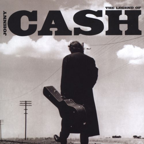
This was the final Johnny Cash Album, a "best of" collection, this album was created after his death in 2003. Here the CASH logo has been revamped to look more western than usual, to suit his country theme, The central image consists of the artist, holding a guitar case, walking down a desert road, most likely in Arkansas or Nashville, one of his home towns. He is walking away from the camera which denotes that the artist is walking away from the world of the living with his guitar or career/legacy.


American IV: The Man Comes Around  
 5 November 2002

Songs in this album: The Man Comes Around, Hurt, Give My Love To Rose, Bridge Over Troubled Water, I Hung My Head, First Time I Ever Saw Your Face, Personal Jesus, In My Life, Sam Hall, Danny Boy, Desperado, I'm So Lonesome I Could Cry, Tear Stained Letter, Streets Of Laredo, We'll Meet Again. 

Image result for Johnny Cash album covers

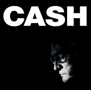
This Album was created not long before Cash's death, due to old age and complications with health, he knew he would soon die creating this album so he created this front cover to show off his old age. The central image is dark and only shows the artists face, he looks old and upset, this was done to denote the theme of death surrounding his album. The music in this album is described as being the most upsetting and was made most famous by the song Hurt, which was the last song Cash created before his death in 2002. The front cover follows the same theme as Hurt, with high emphasis on age.

American Recordings
26 April 1994

 Songs in album: Delia's Gone, Let The Train Blow The Whistle, The Beast In Me, Drive On, Why Me Lord, Thirteen, Oh Bury Me Not, Bird On A Wire, Tennessee Stud, Down There By The Train, Redemption, Like A Soldier, The Man Who Couldn't Cry.

Image result for Johnny Cash album covers

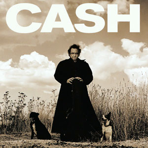
This cover for American Recordings was an older one of Cash's albums, the cover follows the same sobmer themes as most of Cash's covers, with the graney, western filter to follow his country theme. This cover denotes a theme of lonlieness. He stands alone in the desert with no one but the two dogs beside him. The cover still follows the traditional codes and conventionas as the rest of his covers; It has his signature CASH brand and has the Americsan desert themes shown in most of his covers.  

Wednesday, 8 November 2017

David Bowie (Directing his videos)

David Bowie directed his own music Videos. I was given the task of analyzing a couple of his music videos and comparing them to see if his videos follow a theme.

Ashes to Ashes:

 This shot zooms into Bowie, showing him in a padded cell, denoting that he is "Insane" and has been put in a mental hospital. This gives the video a psychedelic feel.
 A lot of Bowie's music videos had a fixation on his eyes, he would usually zoom into his eyes since they were a big part of his persona and theme. His eyes drawn the viewers in with a hypnotic feel.
 This shot establishes a drwam like world, if you look closely the characters resemble that of the characters from wizard of oz, Bowie being the Tin Man. This dream like sequence follows the psychedelic theme.

This shot zooms into Bowie, tied up to a wall of what appears to be a spaceship. This change in style only continues to denote a dream like feel to the video and grabs the viewers interest with the use of set and special effects.


Lazarus:

 This pan shot that pans up Bowie's face reveals his eyes are blindfolded and have bolts covering where his eyes usually are. This is because this was his last video, knowing that he would soon die of liver cancer, so he did this to send the connotation that his eyes are gone or lifeless or dead. This follows the reoccurring theme that his videos have a fixation on his eyes.
 This pan shot  shows a hand, from a woman lying under Bowie's bed (Death Bed) gives the video a horror or nightmare based theme. This follows his style of creating dream like music videos.
This closeup shows Bowie with his hands raised, singing with an upsetting expression. From this I receive the connotation that he is singing or Praying to the heavens, wishing to go to heaven. This shot shows Bowie in a vulnerable and weak state which was used to upset long time fans of the formally lively star and to send the message that he knew that he would soon die.


This final shot shows Bowie entering a wardrobe. This shot is used to denote a symbolism of death. The wardrobe symbolizes a coffin and Bowie leaves his fans with a final goodbye (This video) he didn't want his legacy to end without a suitable end , so he decided to finish his career by his own will. So this wardrobe symbolizes the death of his music career, to die along side the artist.

David Bowie directed his own music videos and followed a psychedelic and dream like theme with each video. He also had a reoccurring theme, the zoom into his eyes. Bowie's eyes aren't the same colour, so he wanted this to be his symbol or calling card.


Main Music Video Research part 2

http://a2-chchs-james-donovan-media-17-18.blogspot.co.uk/2017/09/jay-z-and-kanye-otis.html

Exam Thumb Nails for CD

For our exam we were given the task of; Firstly bringing in CD cases to show our research into how CD cases are designed. Draw a detailed Thumb Nail containing codes and conventions and Finally create our CD case in Photoshop.

Here are the CD cases I could find, however they weren't in the style I wanted. They were plastic and didnt cover all sides, in other ways, lacked detail and utilized all of the space of the CD case.


This is my Thumbnail for my CD case. I included codes and conventions that are usually found on CD cases such as; name of band/artist, Bar code, name of album and the CD plate. While creating this i had an idea of what I wanted my Digipack to look like. I wanted to use stills from my summer project and base the themes and songs used in the "album" from the Music video I made in the summer. I chose two shots of a rosary bead, scenic shots of beaches and a feild and finally Dean, who lip synced in my video, I wanted to place a still of him on my cover.


Monday, 6 November 2017

Exam Process

For our Exam we had to create a music CD case net, using images and based off of our summer project. Here is my process while creating my CD Net.


This is the type of CD because I wanted to create since it had enough space to get all the codes and conventions on and had enough space for detailed artwork or images.


I took Multiple screenshots from my summer project and used them for my CD case, I did this because I wanted the two to correlate the same theme.This image of a beach I wanted to use for the cover of my CD case.


Here I cropped Dean out of one of my screenshots using the Lasso Tool then I zoomed in and used the eraser tool to get rid if the rest of the background without ruining the picture of Dean


Then I copied and pasted Dean into my chosen background, I chose these images because I believed it would suit the theme of my summer project along with the scenery based theme. 


I then began to add text to the cover, I added the name of the artist/band and the name of the album. I did this to follow the codes and conventions of a usual CD case.


I then began to add screenshots of some of my favorite shots from my summer project, I used these as a background layer and would put my text in front of these images. I chose the shot of the rosary because I found it eye catching and it follows the scenic theme from my summer project. I also added a bar code to follow the codes and conventions. 


I added my song list, using some of my favorite songs that have a similar theme to my summer project. I then gave credit to the artists who originally performed these songs. I did this to follow the codes and contentions usually found in cover bands or artists.


Then to get the pattern behind the CD I pasted my image into place by; selecting the outside of the CD ring with the magic want tool. Then I selected the paste special option and finally the paste into option, this made it so the image would only be seen within a certain boundary and wouldn't overlap with other images or text.


finally I finished my CD case. I am happy with this because in such a short amount of time I was able to create a professional looking CD case and followed a large number of codes and conventions. I already, going into the exam, had a slight idea on what I would like a CD, based on my summer video, would look like and I feel like I have captured that image in this exam.